


June 28, 2023 ● 9 min read
Amazon Seller Reports Guide: All Reports Explained With Links


If you’re an experienced Amazon seller, you already know your listing content isn’t just decoration — it’s one of the highest-leverage assets you control.
Yet many sellers still rely on guesswork or generic branding strategies to build their Main Image, Secondary Images, and A+ content. The result? Missed clicks, underwhelming conversion rates, and poor mobile visibility.
In this post, we’ll walk through a structured approach to listing optimization — starting with the Main Image, then your Secondary Images, and finally A+ or A+ Premium content.
This isn’t theory. It’s a cheat sheet built directly from what top-performing brands are doing — and what the data shows matters.

Core principle: Your Main Image must immediately communicate clarity, differentiation, and visual appeal.
Most clicks happen at the Main Image level. Especially on mobile, where buyers are scrolling quickly, your image needs to deliver in under a second. A strong Main Image is one of the few ways you can directly influence your clickthrough rate (CTR) without touching your PPC budget.
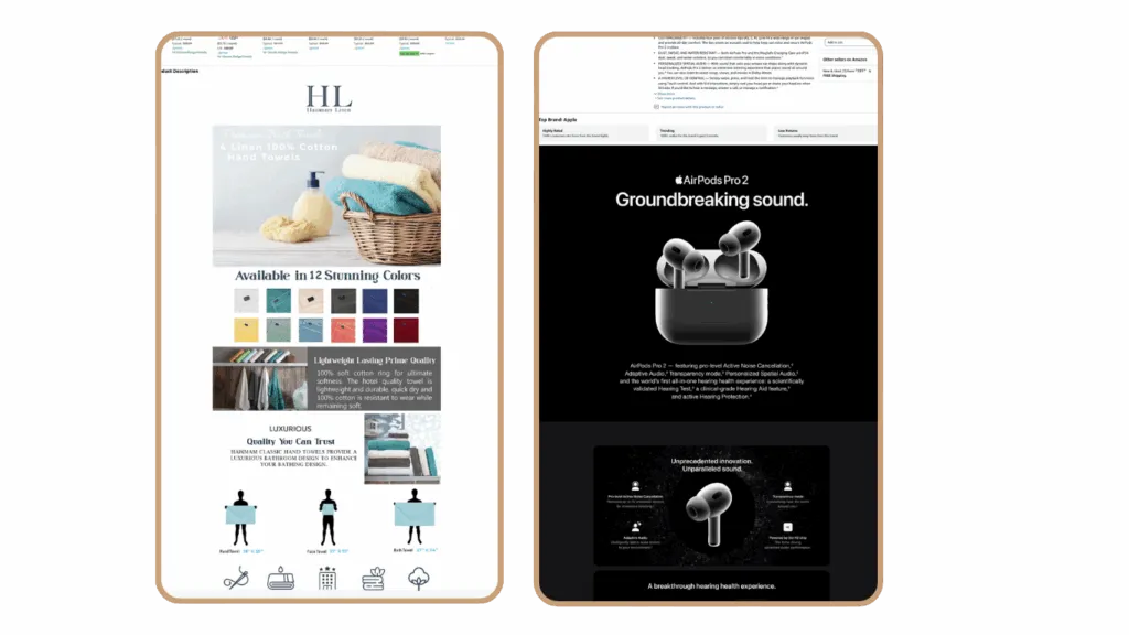
A clear product shot that stands out from the competition
The product should be easily identifiable at first glance
Visual indication of your competitive advantage (e.g., “No Added Sugar,” “Clinically Tested,” “100-Pack”)
Additional cues like bundle size, flavor, or use case if relevant
Text overlays for key benefits — but only if the font is large enough to be readable on mobile
Consider including packaging if it’s visually strong or communicates important info
Highlight key differentiators (e.g., organic, vegan, BPA-free) using badges or icons
Use props or visual framing to suggest use context (e.g., next to a water bottle for supplements)
Make sure the product is fully in frame, not cropped
Test your image’s readability and impact on mobile devices, where most traffic comes from
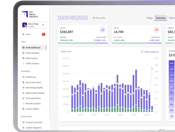
To know if your Main Image is doing its job, check your CTR against market averages using the Search Query Performance (SQP) report inside Seller Central. My Real Profit also lets you overlay CTR vs. market benchmarks so you can track this at scale.
If your CTR is below market average, your Main Image is likely part of the problem.
Don’t copy your competitors’ image angle. Most sellers default to front-facing shots. Try something different — a slight angle, lifestyle backdrop, or zoomed-in detail.
If you use text on the image, check that it’s legible on mobile. Just because it looks good on desktop doesn’t mean it works where most buyers shop.
Core principle: Use these images to reinforce credibility, show proof, and communicate your unique value.
Trust-building (e.g., UGC-style images, badges, brand credibility)
Benefits over features — what your product solves, not just what it is
Visuals that support your biggest selling point
Using low-relevance lifestyle images that don’t add clarity or value
Including redundant shots that repeat what’s already in the Main Image
Ignoring customer voice — especially in categories with emotional buying drivers
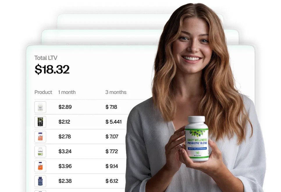
Review analysis should guide your Secondary Image strategy.
Look at your 3-star and 4-star reviews — these often contain:
Unmet expectations
Specific objections
Descriptive language about use cases
These insights are far more actionable than generic 5-star praise.
Use the Customer Review Insights section in Product Opportunity Explorer to surface these patterns. Identify what buyers care about most — and bake that into your images.
Build each image around a theme:
Credibility (trust, reviews, badges)
Main benefit (what it solves)
Functional feature (how it works)
Comparison (why it’s better than alternatives)
Use case (how it fits into buyer’s life)
Core principle: Good A+ content educates. Great A+ content converts.
A+ Content:
Uses a narrower layout
Combines image and text blocks in a fixed format
Ideal for product education and basic storytelling
Has the same visuals for desktop and mobile
Simple to set up but less flexible in layout and design
A+ Premium Content:
Offers a full-width layout with more visual impact
Supports up to 7 advanced content modules like videos, carousels, and comparison tables
Allows for separate visuals for mobile and desktop, improving mobile experience
Looks and behaves more like a landing page, boosting engagement
Better suited for competitive categories where visual storytelling and brand differentiation matter
If you already have A+ content, consider upgrading to A+ Premium. It gives you full control over layout, video, and mobile/desktop experience.
If you don’t have access yet:
Set up an Amazon Brand Story for all ASINs in your catalog
A+ Premium is available after completing 15+ approved A+ projects
A+ content doesn’t change your ranking, but it does affect:
Conversion rate
Customer trust
Reduced returns due to better expectation setting
Especially in competitive CPG categories, A+ Premium can double as a mini-landing page. Buyers scroll down — and if they don’t find value in the Secondary Images, this is where you get a second chance.
A+ content does not automatically adapt to mobile.
This means:
If your layout depends on wide tables or large graphics, test how it renders on mobile
Make sure your hero product image is clearly visible on both mobile and desktop
Avoid using text embedded in images that becomes unreadable on small screens
Preview mobile vs. desktop versions separately to ensure clarity and flow
A+ Premium lets you upload dedicated mobile and desktop assets, so you’re not forced to rely on one-size-fits-all design
You gain access to interactive modules like carousels, video, and comparison tables that auto-adjust per device
With more visual real estate and flexibility, A+ Premium gives you control over layout, sequence, and emphasis
It’s designed to perform like a high-converting landing page, especially helpful in mobile-first categories
Visual comparisons (vs. other products)
Key benefits broken into digestible modules
“How to use” or care instructions
Brand values or mission (only if relevant — avoid filler)
Product certifications, awards, or trust signals
Cross-sell or bundling suggestions for increasing AOV
Think of your A+ layout like a funnel:
Hook with credibility (logo, trust badges, product highlights)
Back it with proof (customer quotes, reviews, lab tests, before/after comparisons)
Close with clarity (instructions, CTA, what’s in the box, complementary products)
There’s no universal “perfect listing.” What works in one category might fall flat in another.
In supplements, clear benefit claims and trust signals often win
In home & kitchen, lifestyle images and real use-case demos matter more
In beauty, aesthetic consistency and premium layout often drive conversions
In CPG, bundling, repeat-use positioning, and NTB-focused content are key
That’s why testing is essential. Every category has its own customer behavior, competitive landscape, and visual standards. What matters is building your content strategy around what your actual customers respond to, not what looks good on a slide.
Check CTR vs. market benchmarks using the Search Query Performance (SQP) report → Look for keywords where your click share is underperforming relative to impression share. If your CTR is lagging, your Main Image is likely the first thing to optimize.
Run review analysis to identify recurring objections or unmet expectations → 3★ and 4★ reviews often tell you what’s missing. Extract that language and incorporate it into your secondary images, A+ content, or bullet points.
Audit the mobile experience → Most traffic is mobile-first. Open your PDP on your phone:
Use Product Opportunity Explorer to surface top customer interests → Go into the Customer Review Insights section. Look at “positive topics” and “mentions over time.” This helps you align your content with what buyers care about right now, not just what you assumed during launch.
Refresh A+ and A+ Premium content based on real data → Swap in new visuals, test different benefit positioning, update comparison tables, or embed video. Think of your A+ content as a modular area — it should evolve with your reviews, competition, and positioning.
Listing optimization isn’t about copying trends — it’s about understanding what your customers actually respond to.
You already paid to get the click. Now use your content to multiply the order size, increase retention, and reduce returns.
Use the tools Amazon gives you — SQP, Product Opportunity Explorer, Review Insights — and test everything.
If you’re not already analyzing performance vs. the market, you’re flying blind. And in a marketplace as competitive as Amazon, that’s no longer an option.
Need to evaluate your listing performance vs. the market?
Tools like My Real Profit help you assess your CTR, order share, and conversion rates — and give you real data to prioritize content improvements.
Try My Real Profit for free and start making the most out of your Amazon data today!